Have you ever wondered exactly what it takes to get people to subscribe to your email newsletter? The first step in the funnel is to create a newsletter landing page that entices them to part with personal details and information like their name, email address, and maybe even their phone number for SMS messages.
But how do you create a landing page that stands out in a sea of competitors?
In this guide, I’ll explain everything you need to know to create a compelling newsletter landing page that will increase your conversion rates, build authority and credibility, and more. Let’s dive right in!
What to Include on a Newsletter Landing Page
Newsletter landing pages are crucial to bolster your email marketing list, which, in turn, drives revenue and awareness of your business.
When you build a landing page, here are some questions you should ask yourself.
Value Proposition: Why Should They Join?

It should be clear right from the top exactly what subscribers get out of the arrangement. They won’t rush to enter their email address if you aren’t clear on why they should join. For some companies, the value might come as a lead magnet or a free item that subscribers get delivered upon signup. On my landing page, I offer a free mini course for anyone who signs up, giving them clear value right away.
In other instances, it might be a convenience factor or insider information.
No matter what your newsletter promotes, you should make sure that it’s crystal clear what you deliver to your audience. A value proposition should be top of mind whenever you create content for your audience, and your email newsletter landing page is no exception.
Opt-in Form: How Easy Is It to Sign Up?


Do you make it easy for people to enter their email addresses on your landing pages? You don’t want the process to take five minutes for someone to access your secret sauce. Instead, you want them to be able to enter their name and email address and then reap the benefits.
Too many fields to fill out will cause most people to bounce before signing up for your offering.
Authority: Why Should They Trust You with Their Email?


People are more averse to handing out their email addresses than ever before. Their inboxes are already flooded with junk mail, so they think twice about handing it over to you. Your signup form should indicate who you are and why they should trust you.
This could mean including a few testimonials from current subscribers, customers, or clients. If you have a lengthy email newsletter list, you might want to share the number of subscribers you have (think of some pages that say they have 100,000+ subscribers).
Your newsletter landing page should display any kind of social proof, award, or expertise.
Headline: What Draws Their Attention?
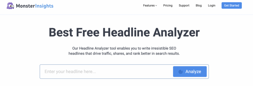

Do landing page visitors feel compelled to click through your link? Your headline is one of a few key elements that stand out. A successful landing page is going to have a click-worthy headline that will convince people to part with their email addresses.
You can leverage tools like Monster Insights (my favorite free option) or premium tools like Coschedule. Both help you create a clear and concise headline.
Visually Appealing Design: Does It Look Professional?
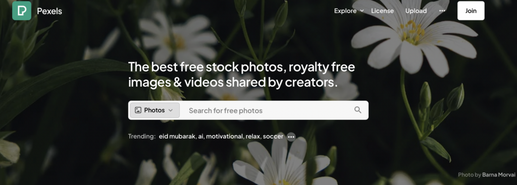

Last but not least, you must ensure that your landing pages represent you and your brand well. You want something that looks visually appealing and speaks to your target audience. Use images that stand out, colors that are pleasing to the eye, and a minimalistic design that displays your clear value proposition.
Low-resolution images and poor image quality can make your landing page look unprofessional and won’t entice potential readers to fork over their personal details. I like to find my high-quality images from free sites like Pexels.
7 Best Newsletter Landing Pages to Learn From
Looking for a newsletter page you can model your own after? These newsletter landing page examples will make you think about the possibilities.
1. NYT Subscription Form
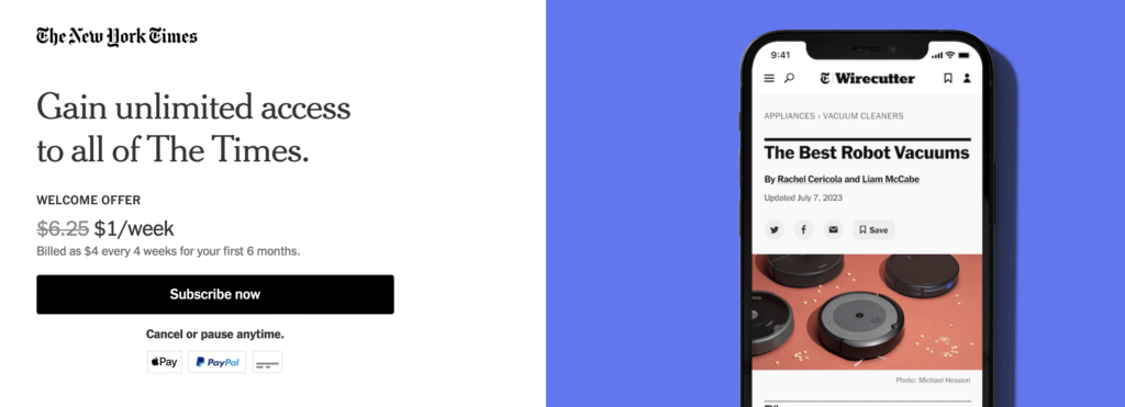

The New York Times is a clear authority on all things newsworthy. Their signup page is clear and easy to follow, with a specific call to action in a bold black button. Their value proposition is clear (unlimited access to their news outlet), the cost is apparent, and it’s easy to click through.
There are no extraneous details here that could distract you from their main offering: subscriptions to the digital newspaper. While their example is a little different because they charge for access, it might give you some ideas of how you can monetize your newsletter subscribers.
2. Daily Skimm
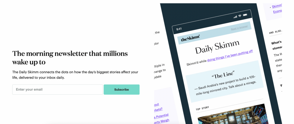

Much like the NYT subscription landing page, Daily Skimm makes it clear what they offer to their users. They include social proof by mentioning their number of subscribers, give a sleek inside look at what the newsletter will look like, and create a clear opt-in form.
Scroll down the page a little further, and you will see what they offer to insiders. You get a quick glimpse at the daily news and its top articles, which should convince you that they are the email newsletter you need. It’s a good landing page that demonstrates simplicity and delivers value.
3. Ali Abdaal
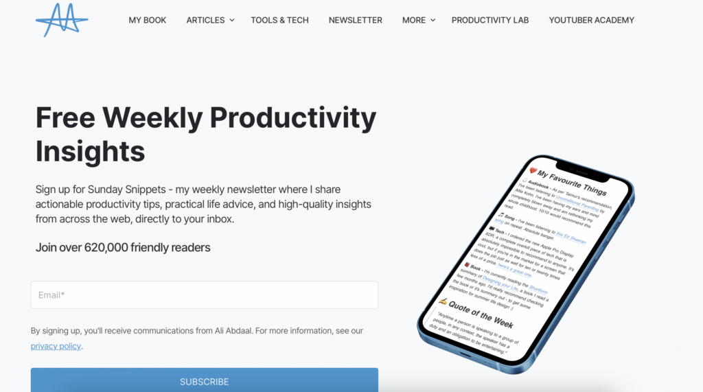

Ali Abdaal is my favorite productivity guru with a popular YouTube channel and a book (Feel Good Productivity), but he also has an email newsletter. Like Daily Skimm, he advertises how many subscribers he has (620,000 and counting). He also shares exactly what his newsletter is about and when you can expect to receive it in your inbox.
His brief description makes it easy for you to decide whether it offers what you need and want in your inbox without pressuring you to make a decision. Plus, it’s easy to enter your email address and gain access quickly if you decide it’s right for you.
4. Milk Road
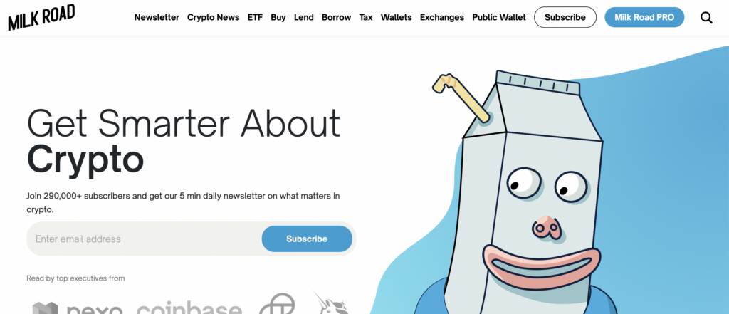

In a slightly different vein, Milk Road has an easy opt-in form with some of the same key elements we covered here but applied to a different industry. Their email newsletter about crypto offers a quick five-minute read each morning (value proposition). All you have to do is enter your email address, and you’re in (easy opt-in).
They also state the number of subscribers they have and the top companies that subscribe to their daily newsletter (social proof).
5. The Publish Press
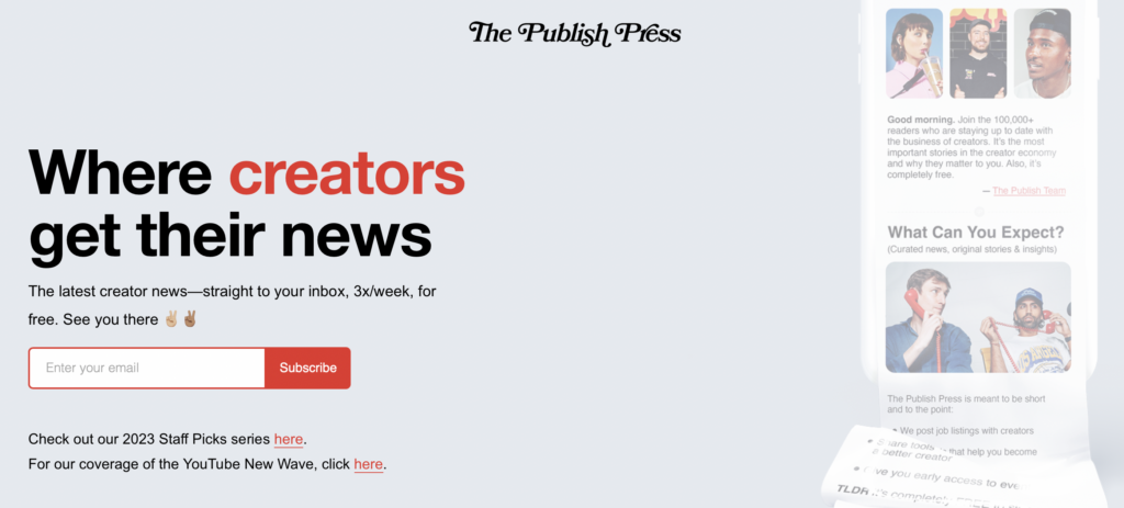

Another news site, The Publish Press still manages to set itself apart from the competition. It’s clear up front exactly what they have to offer, which is news for creatives. You know when you’ll receive an email from them with a 3x weekly newsletter and you know that it isn’t going to cost you a dime.
Like all of the newsletter landing page examples we’ve covered here, it’s extremely easy to opt into their newsletter simply by entering your email address. You can even get a small taste of their content before you sign up for their newsletter, giving you a good sense of their vibe and usefulness.
6. Lenny’s Newsletter
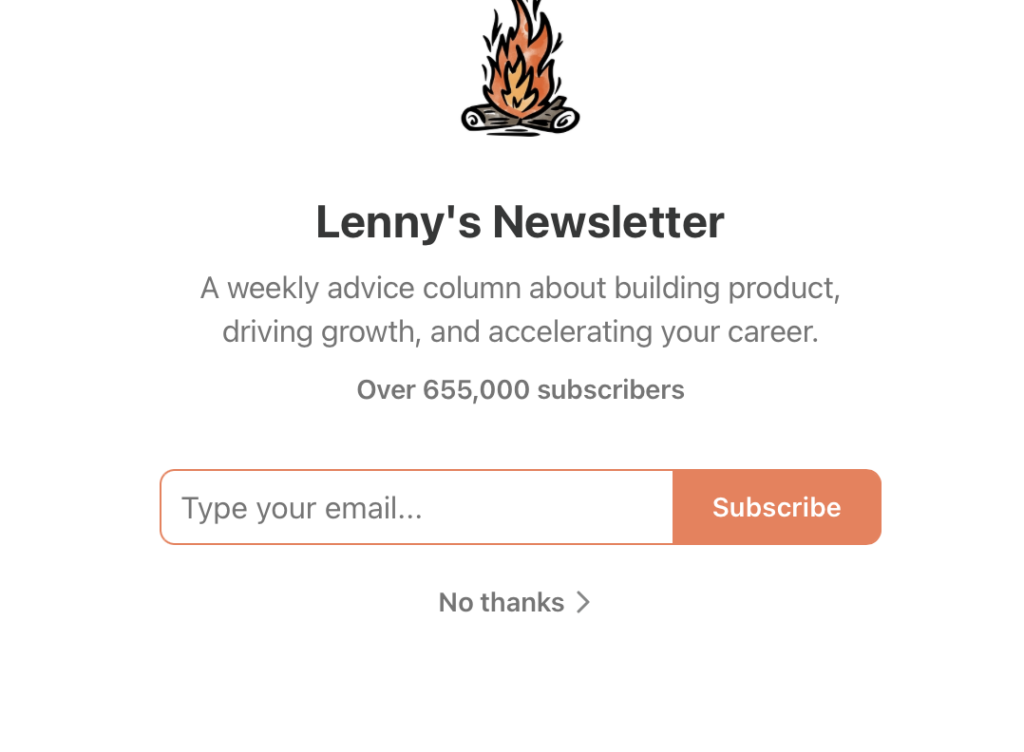

Lenny’s Newsletter is one of the most simplistic newsletter landing page examples you’ll find here. It is an extremely sparse webpage with a small logo graphic, a short snippet about social proof, and a line with the number of current subscribers.
There’s only one box for you to enter your email address and the call-to-action button is bright orange. You can’t miss what Lenny Rachitsky wants you to do on this clear and simple-to-follow landing page.
7. Morning Brew
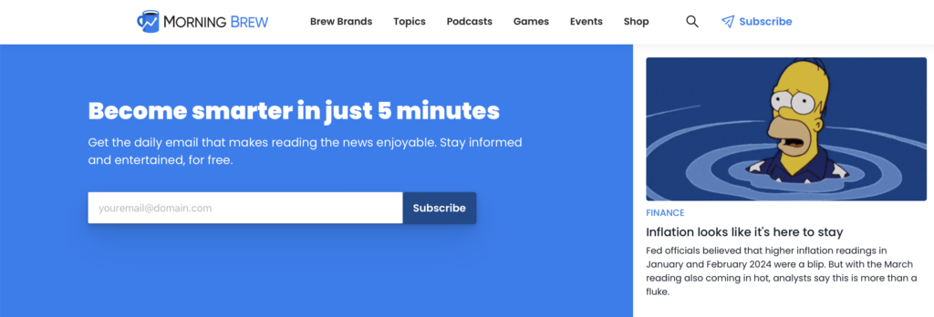

The Morning Brew newsletter page is a little more robust than some of the other landing pages you’ll find in these examples. The opt-in form is found right at the top with a bold blue color, a clear value proposition, and an easy opt-in form.
If you aren’t sure whether their newsletter is right for you, then you can keep scrolling to see examples of their news stories. They have tons of articles you can click through and read without signing up for their newsletter at first. It’s a great way to give potential subscribers a taste of what they’ll get in their inbox every morning.
Benefits of a Newsletter Landing Page
Having a dedicated landing page like those included above is essential to growing your list. In turn, this comes with some serious benefits for your business. Here are the benefits of a compelling landing page.
Improved Conversion Rates


The first and most significant reason to create a newsletter landing page is that it significantly improves your conversion rates. A standard website might only convert at two to three percent, but your landing page can convert at 20 percent or more!
It’s easy for people to see why they should sign up and how to do so when done properly.
Makes a First Impression
A high-converting landing page is your opportunity to put your best foot forward and make a solid first impression. This might be the first time a prospective client is going to see your logo and branding, and they want to have a positive experience with you.
Hook them now with a great first impression, and you may gain access to their wallet tomorrow. Your landing page makes your marketing more effective (and cost-effective) than plastering your town with homemade flyers.
Target a Specific Audience or Offer


As you saw with some of our newsletter landing page examples, you can target a very specific audience with your signup form. You can include fields for people to fill out some of their personal details, which permits you to segment your newsletter list to target the right offer to the right people at the right time.
You may also be able to create unique landing pages for specific customer personas, ensuring that you deliver exactly what they’re looking for at the perfect time.
Builds Authority and Credibility
Everything from your landing page URL to your website copy should have one purpose: building your authority and credibility. If you can include social proof of your expertise, people are more likely to sign up and turn to your advice as an expert in the industry.
Tools to Build an Outstanding Newsletter Landing Page
Don’t have the coding expertise to create a newsletter landing page out of HTML and CSS? The good news is that you don’t have to know a thing about writing code to create stunning landing pages. We included two tools you can harness here.
Unbounce: Best Premium Landing Page Builder
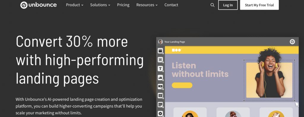

If you have a small budget to spend on building your email newsletter landing page, Unbounce should be top of your list. Using their landing page templates, you can create and test different opportunities before deciding what works best for your target audience.
Plus, you’ll never run out of designs with more than 100 templates.
Unbounce features a drag-and-drop editor that makes it easy for anyone to customize their landing pages with just a few clicks of the mouse. They have lots of integrations so that you can make use of their tool with your existing tech stack. You can even use popups with their builder.
Pricing starts at $74 per month (billed annually). You can check out our full Unbounce review here.
ConvertKit: Best Free Landing Page Builder
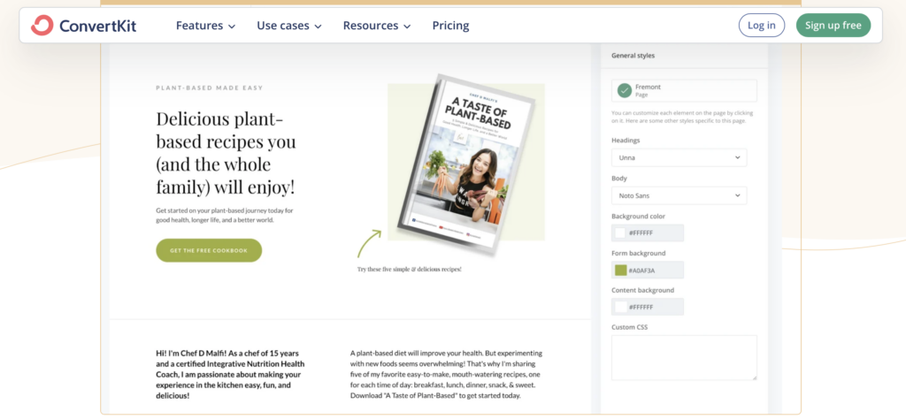

On the other hand, not everyone has the budget to create a landing page for newsletter sign-ups. If not, you can still harness the power of a free landing page builder with ConvertKit.
Like Unbounce, ConvertKit offers fully customizable templates to get you running with an effective landing page quickly. They provide you with access to Unsplash so that you can integrate free images into your landing page. Additionally, their websites are mobile-responsive so that anyone can use them.
Features of their newsletter builder include:
- Collecting custom data
- Delivery of a lead magnet
- Automation connections
- GDPR-compliance
- Integrations with other tech tools.
Don’t miss Spencer’s ConvertKit review if you think this might be right for you, or check out more options for the best landing page builder here.
Final Thoughts: Build a Newsletter Landing Page Today
A newsletter landing page is one of the essential elements of a robust marketing strategy that relies on a direct connection to your target audience. Whether you opt to use free tools like ConvertKit or a paid subscription to Unbounce, there are tons of ways you can build your own landing page today.
How will you leverage this important marketing tool in your business in order to see your subscribers grow?
