Having a strong online presence is crucial for consulting firms aiming to distinguish themselves. It’s about attracting new clients and demonstrating expertise, sharing valuable insights, and building trust with potential customers. With this in mind, I’ve compiled a list of some of the best consulting websites.
These stand out due to their design, ease of use, and overall appeal, exemplifying exceptional web design in the consulting industry.
If you’re looking for ideas to improve your site’s navigation or to create engaging content for your audience, these examples offer plenty of inspiration.
7 of The Best Consulting Websites
From engaging content that positions them as thought leaders in their industry to sleek, user-friendly designs that ensure a seamless browsing experience, these best consulting website examples showcase the pinnacle of professionalism and brand presentation online.
Let’s deep-dive into examples of standout consulting websites and explore the key elements that elevate them above the rest.
1. Boston Consulting Group

Leading consulting firm The Boston Consulting Group’s website features a sleek and modern design that captures the essence of their brand: innovative, data-driven, and forward-thinking.
The homepage immediately draws the viewer’s attention with its dynamic visuals and bold messaging. The navigation is intuitive, making it easy for visitors to find what they need quickly.
My favorite part of this website is the About page. It’s particularly well constructed, with a striking video set to a heartbeat soundtrack highlighting the firm’s mission and values while showcasing its global reach and expertise.
2. Jeremy Malcolm


Jeremy Malcolm’s website stands out for its well-organized and informative content. The site effectively showcases Malcolm’s area of expertise as a Trust and Safety consultant in a straightforward manner that allows potential clients to quickly understand his capabilities.
The color scheme is monochrome with jade accents, making the CTA buttons and social media icons stand out. I found the transitions on this site to be smooth enough to keep any website visitor engaged.
The blog section is frequently updated with informative articles, reinforcing Malcolm’s status as a thought leader in the industry.
3. Samantha Alice


Samantha Alice describes herself as an extra pair of hands for your next project.
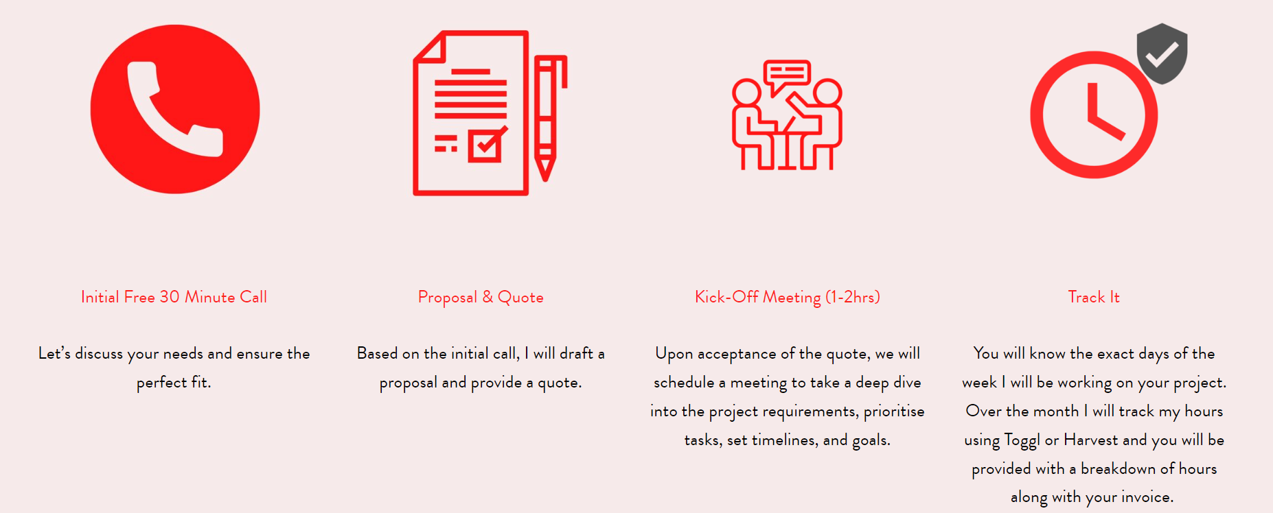
I particularly like her Trust page, which describes her onboarding and working process. It offers a glimpse into what it would be like to collaborate with her.
Her portfolio and testimonials showcase her versatility and skillset, effectively communicating that she’s an ideal choice for any project.

4. Peoplism
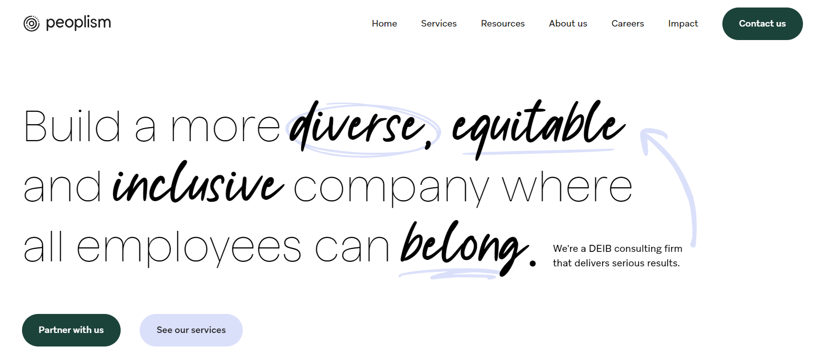

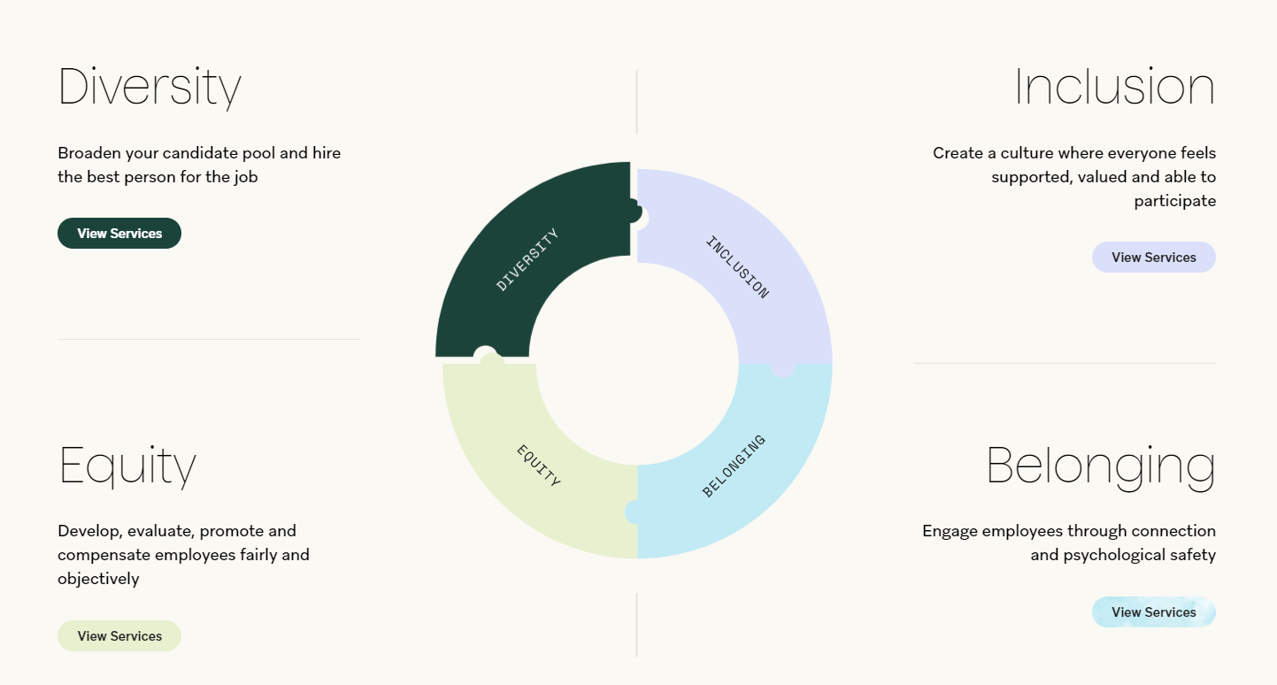
Peoplism‘s website has a magazine-style design with eye-catching graphics and layout. Their homepage clearly communicates their mission to connect businesses and people using organizational psychology.
It offers articles and resources on workplace culture and leadership, making it a great tool for HR professionals or business owners aiming to boost their company’s performance.

5. Matt Olpinski
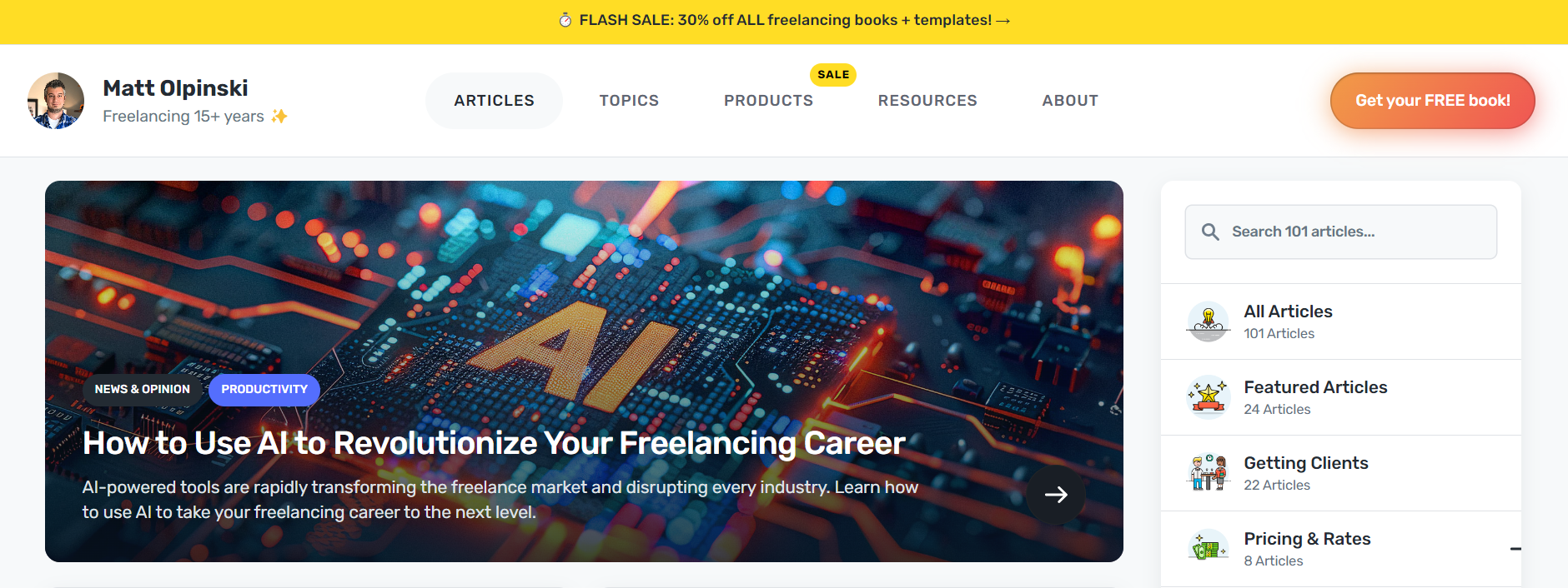

Explore the world of Matt Olpinski, whose expertise in web design and development transitioned from freelancing to the foundation of his own design company. His website showcases his significant work with giants like Marriott, Bloomberg, Facebook, DHL, Porsche, PayPal, Coca-Cola, and American Express.
Matt’s site is more than just a portfolio; it educates over 50,000 freelancers each year, offering advice on client acquisition, pricing, and freelancing success.
His site has valuable resources, including articles, a helpful newsletter, practical products to purchase, and a free book to boost a freelancer’s career.
6. Valoppi Ventures


Valoppi Ventures‘ website is another simple, only-slightly-more-than-one-page, well-designed website. The serif font adds a touch of sophistication, and the color scheme is neutral and calming.
Patrick’s carousel of testimonials effectively showcases his satisfied clients, and the website conveys professionalism and expertise to his target audience cleanly and concisely.
7. Jack Dalrymple
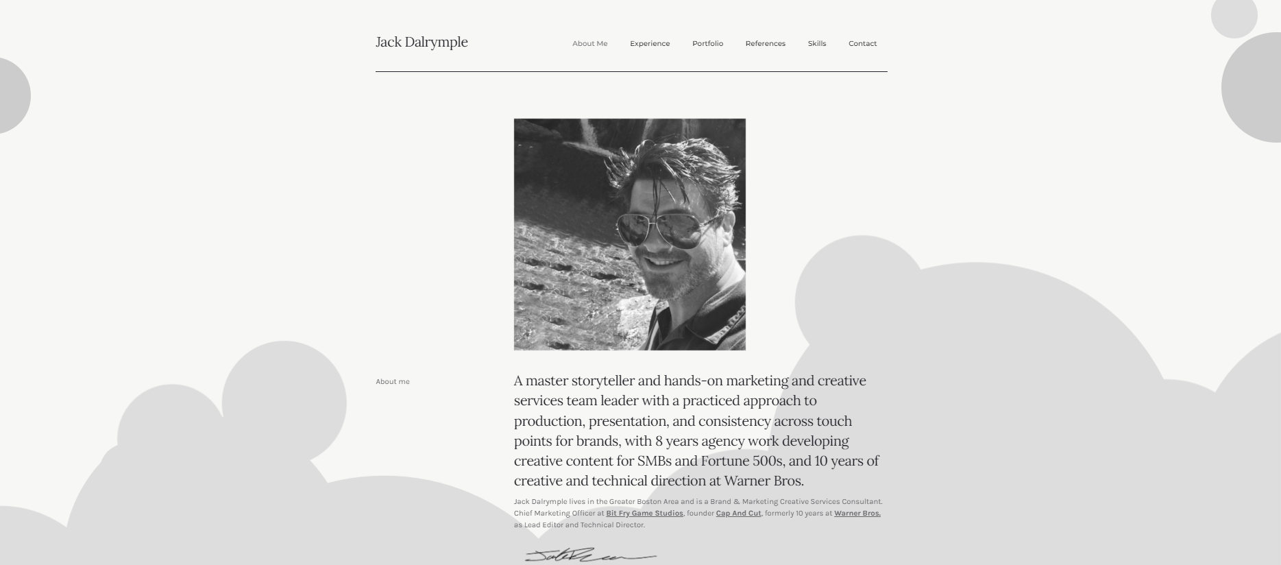

Jack Dalrymple’s resume style and one-page website design are great examples of balancing professionalism and personality. With its clean layout, clear messaging, and high-quality photography, this site exudes an air of credibility and expertise.
The first section effectively communicates detailed information about his career and abilities, and the case studies section adds depth to his portfolio.
Why Your Consulting Firm Should Have a Website
A professional website for your consulting firm is paramount. Here’s why:
- Increased Visibility: A well-designed website elevates your consulting business, making it easily discoverable via search engines and helping to attract new clients.
- Cost-Effective Marketing: Websites serve as a cost-efficient marketing platform, allowing you to reach a wider audience at a fraction of traditional advertising costs.
- Showcase Services and Expertise: Use your website to demonstrate your consulting specialties, successful case studies, and unique problem-solving skills. This can significantly attract clients looking for tailored solutions.
- Convenient Communication: Streamline communication with clients through your website by incorporating contact forms, email links, and direct calling features.
- 24/7 Availability: With a website, your consulting services are accessible anytime, providing potential clients the convenience of discovering your offerings and expertise around the clock.
- Online Booking and Scheduling: Facilitate the process of engaging your services by offering online booking or project scheduling capabilities directly on your site.
- Competitive Edge: Maintaining an up-to-date website signals that your consulting business is keeping pace with digital trends, setting you apart from competitors.
- Centralized Information Hub: Make it easy for clients to find important information about your services, contact details, and special offers or insights through a comprehensive and organized website.
If you’re just starting on your journey toward becoming a consultant, check out our article on consulting business ideas. You may also find our post on how to start a consulting business useful as a step-by-step guide.
What Do The Top Consulting Websites Have In Common?


Your website can be a valuable asset. Understanding the critical components of the best consultant websites and implementing these in your own website can significantly impact your online presence. These components include:
- Professional design: Your consultant website should feature a sophisticated, clean design that reflects your consultancy’s brand identity. It should employ high-resolution images and a color scheme that aligns with your branding. Navigation should be straightforward, even for less tech-savvy visitors, with a user-friendly interface that allows visitors to easily find what they want.
- Mobile responsiveness: With so many mobile web users, your site must be responsive across various devices, ensuring a smooth browsing experience for all visitors.
- Search engine optimization (SEO): Boost your visibility online with an SEO-friendly business website. This includes using relevant keywords, optimizing images for faster loading, and improving site speed.
- Streamlined contact forms: Have an easy-to-use contact form prominently featured to make it simple for potential clients to reach out, which can generate leads for your agency.
- Effective call-to-action buttons: Use eye-catching buttons strategically placed across your website to guide visitors to engage with your content, request more information, or schedule a consultation.
- Clear and accessible information: Present your consultancy services, your team’s expertise, case studies, and contact information in a clear, jargon-free language, ensuring prospective clients understand what you offer and how you stand out.
- Consistent updates and maintenance: Ensure your website remains effective and secure by regularly adding fresh content, checking for broken links, and performing routine maintenance.
If you’re stepping into the consulting field, explore our database of consulting business name ideas and consulting business slogan ideas to kickstart your branding effort.
Essential Pages for Your Consulting Website


To present your consulting company and attract potential clients effectively, make sure your consulting website has these essential pages:
- Homepage: Your consulting website’s home page must grab visitors’ attention immediately. It should quickly summarize your consulting services and make it easy for users to navigate the site with clear and intuitive pathways.
- About Us: This section should tell the story of your consultancy firm’s history, mission, and core values, showing your team’s expertise and credentials in your consulting niche.
- Services: Clearly state your consulting services, using detailed descriptions and relevant images or videos to help potential clients understand what you can do. Specify whether you specialize in corporate consulting, work with non-profits and startups, or offer a broad range of services for various client types.
- Testimonials: Include feedback from previous clients to reinforce your credibility and help persuade prospective clients to sign up for your services. These testimonials can be featured on a standalone page, homepage, or services page.
- Contact Us: Provide essential contact information such as phone number, email address, and physical office location. If relevant, incorporate a contact form and a map indicating your office locations.
- FAQs: Answer frequently asked questions about your consulting services to alleviate potential clients’ concerns or hesitations.
- Blog: Use a blog to disseminate industry news, advice, thought leadership articles, and updates about your consulting agency. This will help you engage with your current and prospective clients and improve your site’s visibility on search engines.
- Success Stories: Demonstrate your consulting firm’s expertise and the value you bring to clients with a portfolio of case studies and projects, reinforcing trust and setting clear expectations for potential clients.
How to Build a Website For Your Consulting Agency
Using WordPress combined with Bigscoots Hosting, you can create an effective consulting website hassle-free and economically. WordPress offers a user-friendly platform that lets you effortlessly craft a website highlighting your consulting expertise without any need for coding.
With its customizable themes and plugins, adding features like appointment booking, contact forms, and client testimonials to your site is easy, improving the user interface and experience.
Bigscoots Hosting offers reliable, fast, and secure hosting for WordPress sites, ensuring your website is always up and running. Their service promises quick load times and strong protection against online threats.
By using WordPress and Bigscoots Hosting, you can build a professional consulting website that stands out from the competition.
Best Website Builders for Consulting Websites


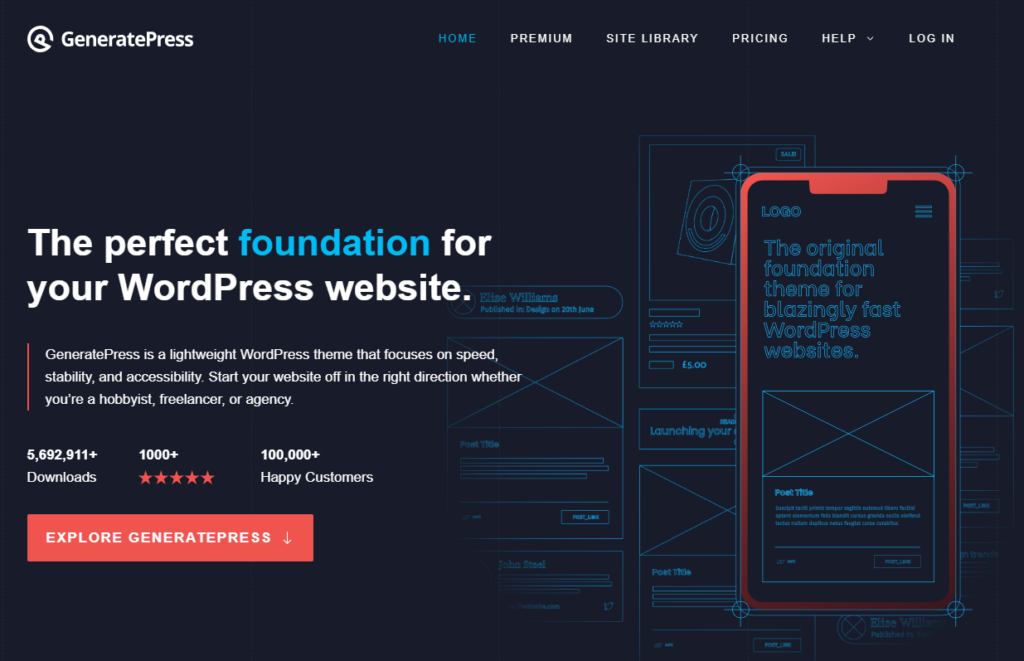
For consultants, having a polished and informative online presence is key to drawing in top-tier clients. GeneratePress and Astra are top picks for creating consulting websites, thanks to their exceptional speed, adaptability, and design choices.
- GeneratePress stands out for its clean, modern look, which gives off a professional and authoritative vibe. It is perfect for consulting firms. It loads quickly, enhancing user experience and lifting your site’s SEO ranking. This makes your consulting services easier to find for potential clients.
- Astra stands out with its large selection of ready-to-use templates designed for consulting businesses. These templates enable quick and easy setup of a polished, professional website. Astra’s easy customization and quick performance let your consultancy clearly display its skills and services.
Using GeneratePress or Astra website builder for your consulting website creates a powerful and easy-to-use online platform, boosting your firm’s credibility and engaging more clients.

Final Thoughts on Consulting Websites
A well-designed consulting website is an essential marketing tool that attracts potential clients and establishes your credibility as a professional consultant. Implementing best practices from exemplary consulting website designs can significantly enhance your business’s online presence.
Get your consulting website up and running now – you’ll be amazed at the difference it makes!
