Understanding the elements and principles of design is fundamental if you’re venturing into the world of visual art or simply want your ventures to stand out!
Knowing these concepts will give you an edge, whether you’re a graphic designer, an aspiring artist, or a creative enthusiast.
In this post, I’ll dive deep into the core components of design.
You’ll learn each visual element from point to texture and how they contribute to creating a visual composition.
Then, I’ll cover the principles that guide the use of these elements, from contrast to pattern, ensuring your design looks good and feels right.
Let’s get started.
Elements of Design
The elements of design are the building blocks of visual art, including point, line, shape, and space. Together, they combine to create visually engaging compositions in any design project.
Let’s break each element down to broaden our perspective of how they work.
1. Point
Points are the smallest and most basic aspect of any design. They can bridge connections to form other elements like lines but can also be used alone to create patterns and texture.
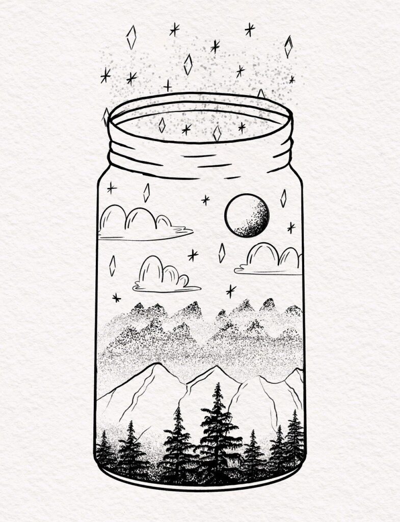
The points in this image form the start and end of all the lines, including the mountains, clouds, and the moon.
But they also make up the mountains in the background and the shadows behind the trees.
2. Line
Lines are the most essential elements in design, forming a distinct mark between two points. Lines can be straight or curved, thick or thin, and are necessary for creating shapes.
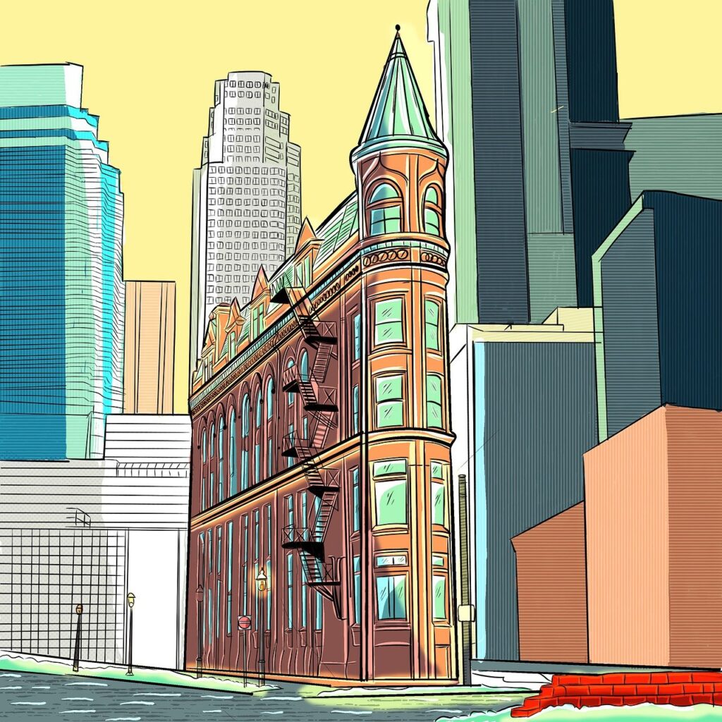

The lines in this image run in every direction, some parallel and others perpendicular to each other. They’re also used to add details to the buildings and individual bricks to the wall.
3. Shape
When lines join up and enclose an area, they form a shape. Shapes are two-dimensional and can range from simple organic shapes to one’s more complex, like geometric shapes.


The image above is mostly made up of shapes – from the large circle depicting the sun to the birds and the silhouette-like buildings.
Even though most of the shapes here are symmetrical, we can still see some asymmetrical shapes, such as the birds, but are still classed as shapes.
4. Form
Forms are shapes that become three-dimensional.
Form adds depth and makes certain things pop off the page. It can transform a circle into a sphere or a square into a cube.
Using forms makes artwork and designs more realistic.


This image is a great example of form because we can still see that it’s made up of shapes; only some have shadows and texture, which gives them form.
5. Color
Color provides the most psychological aspect of design, as it’s how most humans see reality. In design, color tells a story, sets the mood, and adds character and personality.
Here are just a few characteristics that make up color:
- Hue: Hue refers to the dominant color category, such as red, orange, yellow, green, blue, and violet.
- Saturation: Saturation refers to a color’s vividness. Highly saturated colors appear vivid and intense, while desaturated colors appear faded or washed out.
- Brightness: Also known as value (more on this next), brightness refers to how light or dark a color appears. Bright colors are brighter, while dark colors are low in brightness.


This image of a robot would tell a completely different story if the colors were different.
For instance, if the flowers were faded and turning brown and the robot was dull and rusted. But instead, the bright colors help paint a scene that is innocent and welcoming.
6. Value
Also known as brightness, value determines how light or dark colors are. It creates depth and mood by showing how light and shadow fall on objects.
If you’ve ever used Instagram to enhance an image, you’ll have seen the highlight and shadow options. These allow you to brighten or darken certain areas of an image to add more character.


In this image, value sets the mood of a wet and dreary scene. The darkness of the trees and shadows on the tractor emphasize a dark and mysterious atmosphere.
7. Texture
Texture refers to the physical or visual surface of the design or artwork. It can be rough, smooth, hard, or soft to the touch or simply appear that way. It makes things look tangible and adds a level of realism.
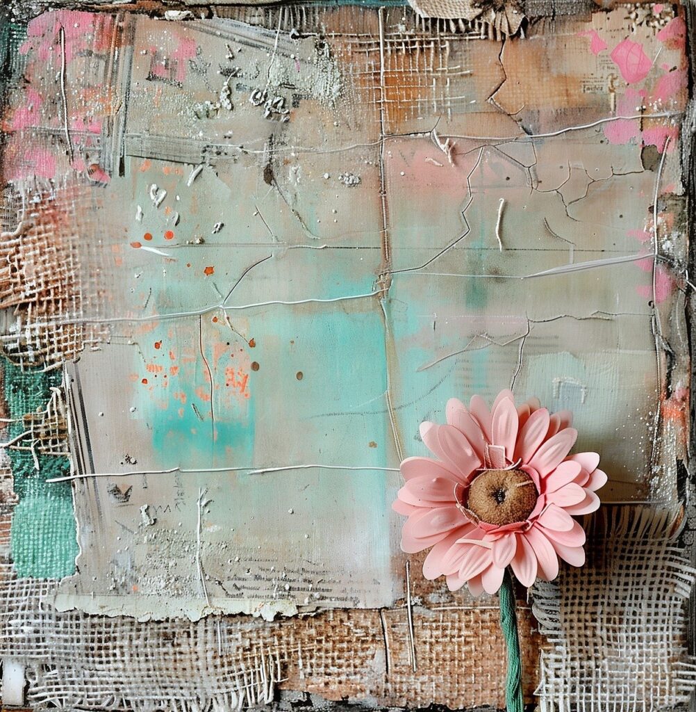

This painting represents texture using meshed fabric, thick paint with broad brush strokes, and a flower that looks like it stands out from the canvas.
8. Negative Space
Also known as “white space,” this design element uses space as part of the design. It can also use the other elements to create the illusion of added information, which tricks the eye into thinking something is there.
Negative space is a big component in web and graphic design, creating a feeling of minimalism and simplicity.
It provides breathing room between other design elements to highlight spaciousness.
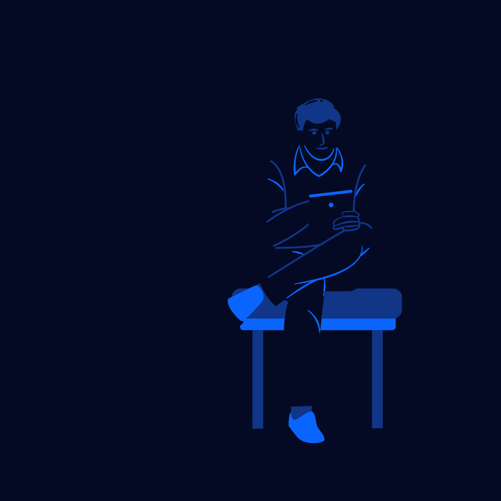

This picture cleverly uses negative space to outline the person’s body. Even though there is nothing there, we can make up where his legs and body are based on the elements around him.
Principles of Design
Design principles are guidelines that dictate how to use the elements effectively. They help designers capture the essence and personality of the subject in aesthetically pleasing ways.
These are the principles of design to enhance your creative genius.
9. Contrast
Contrast creates definitions and emphasizes different elements. It can highlight differences through close association or make things stand out in juxtaposition.
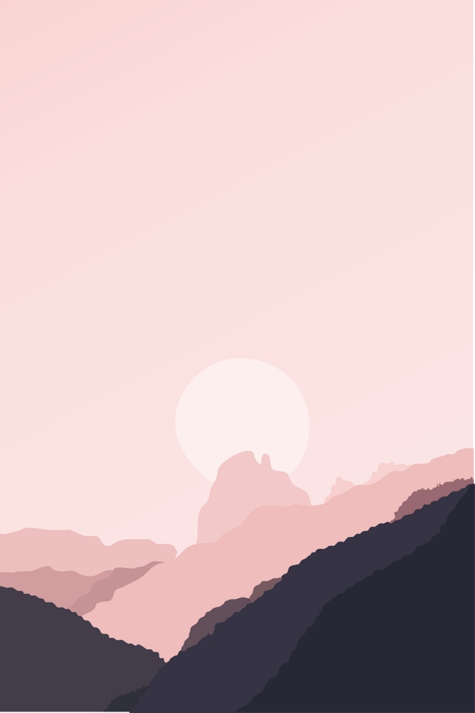

In this simplistic yet elegant design, a contrast in colors adds depth of field and distance between objects.
10. Balance
Balance ensures your design isn’t lopsided, where there’s more going on in certain areas than others.
It’s all about weight and symmetry. Visual weight ensures things are evenly distributed, like this image of a beach with water and trees. There’s enough balance throughout, thanks to the clouds and reflection in the water. Yet, still offers some variety.


Symmetry, on the other hand, is a more purposeful design in which everything is even—vertically, horizontally, or both.
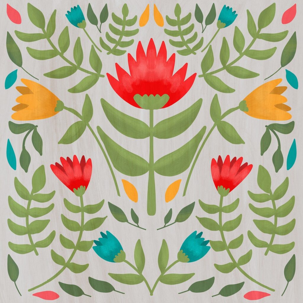
This painting of these flowers is a perfect example of symmetrical balance, where everything is a mirror reflection from left to right.

11. Emphasis
Emphasis is where you use elements to make things stand out. Color, value, and texture are just a few ways to achieve this, but also principles such as contrast movement and proportion.
Emphasis is also used to create a visual hierarchy in design. This is where certain elements guide the viewer’s eye through a planned sequence of elements. This can be seen commonly in web design and print.
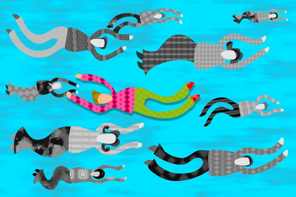

This image creates emphasis in several ways. It uses direction to differentiate the characters from the ones that stand out. Pattern also helps differentiate things, and color and contrast make things stand out and blend in.
12. Movement
Movement is like the little brother of emphasis. Where emphasis draws the viewer’s attention to specific elements in an obvious way, movement is more subtle.
Also known as direction, movement uses elements to lead the eyes from one location to another.
It creates a visual flow throughout the design in a smooth but intentional way.


Here’s a great example of movement at work. The direction of the road bending around the mountains in the distance leads the eye towards the sunset.
13. Pattern
Pattern uses a repeated arrangement of elements to create consistency and unity throughout. It can subtly add visual texture and depth. Patterns can be regular or irregular, symmetrical or asymmetrical balance.
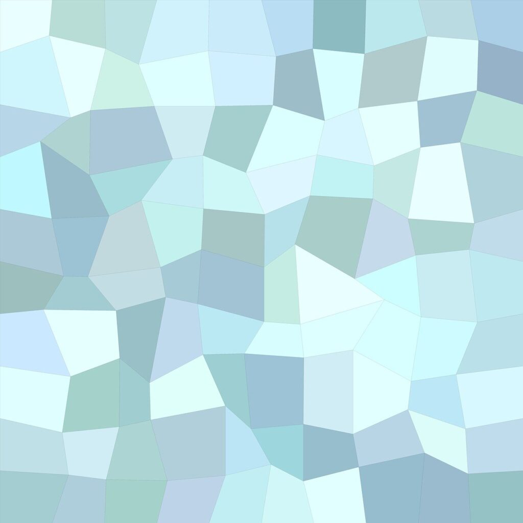

This pattern is unique because it uses irregular shapes that seem random. Yet, it still feels consistent and like it repeats itself.
14. Repetition
The principle of repetition goes hand in hand with pattern. Where patterns can be more random, repetition is something. It creates consistency, especially in web design tools, where things like colors and buttons need congruence to build trust and familiarity.
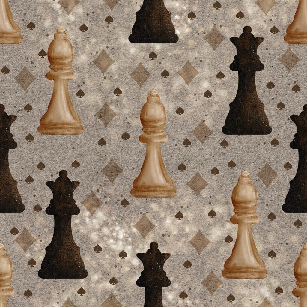

Here’s a patterned design that follows the repetition principle. The layout of chess pieces follows the same suit over and over again. It’s symmetrical with the same repeating pattern in the background.
15. Rhythm
Rhythm is like a combination of pattern, movement, and repetition. It creates a visual tempo that is consistent and systematic. Picasso’s work used a lot of rhythm, and other artists with a distinct brand or feel are quite rhythmic.
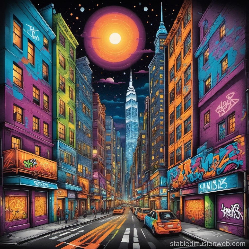

This picture of an evening-lit city street encapsulates rhythm perfectly. The digital design feels lively, as though dancing or vibing to its virtual music.
16. Proportion
Proportion refers to the relative size and scale of elements in the design. It’s essential for making things look three-dimensional and also adds direction and hierarchy.
Proportion adds order and perspective, creating a relationship between elements.
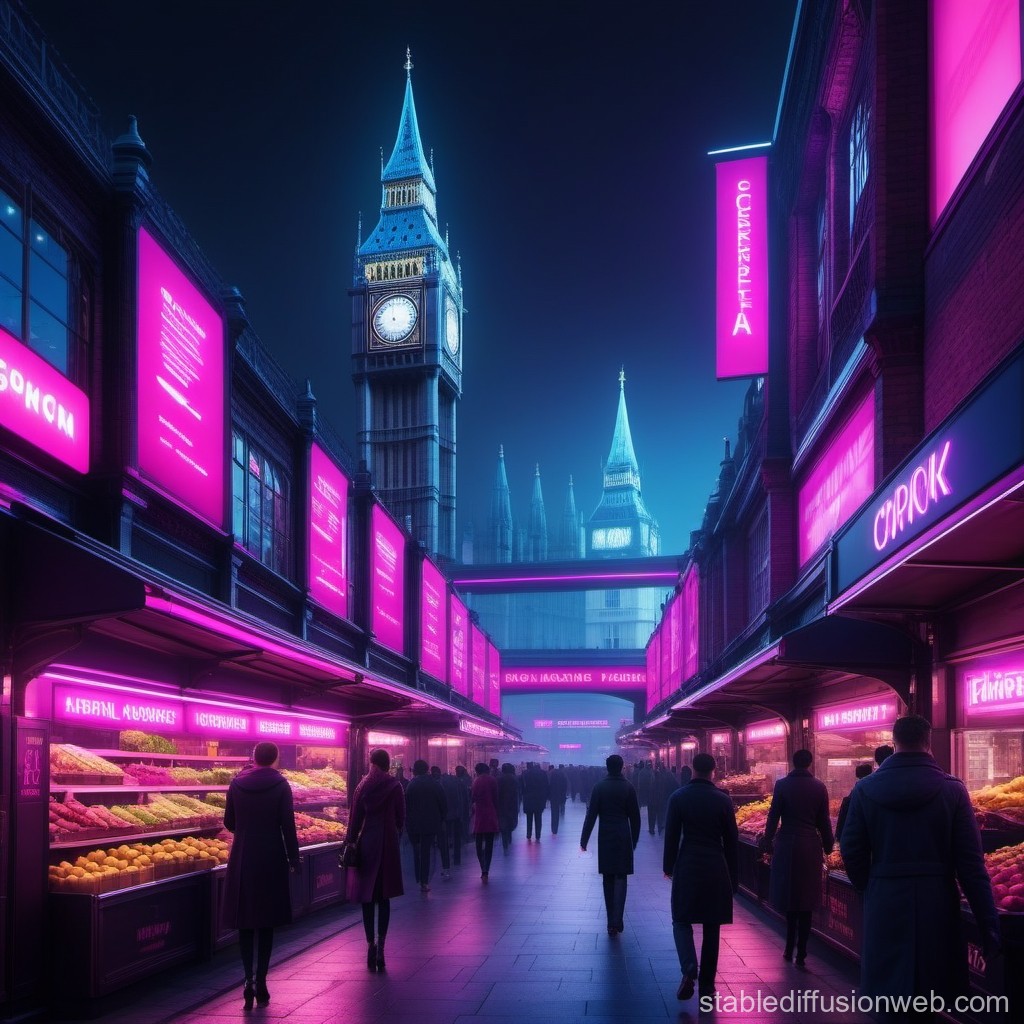

This image uses a lot of proportion and scale to emphasize the different sizes of elements. It gives a sense of clarity to the size of Big Ben in the distance to the market stalls that are closer.
17. Variety
Variety mixes various elements and principles to add complexity yet visually appealing designs. It creates interest and detail in images and artwork to engage the audience.
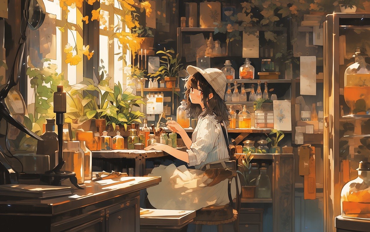

This beautiful painting feels pleasant to the viewer’s eye yet has so much going on. It brings together lines, shapes, forms, values, and many of the principles we’ve already discussed.
This also brings us to the last design principle, which is unity. Even though this image has a lot of variety, it has an overall harmonious aspect, creating a sense of unity.
18. Unity
Unity is the ultimate accomplishment in visual design. It’s when every design element and principle comes together as one, creating harmonious flow and tranquility. It also forms a sense of completion and wholeness.
Unity can also reveal symbolism to the viewer, creating a subjective experience that is unique to the viewer.
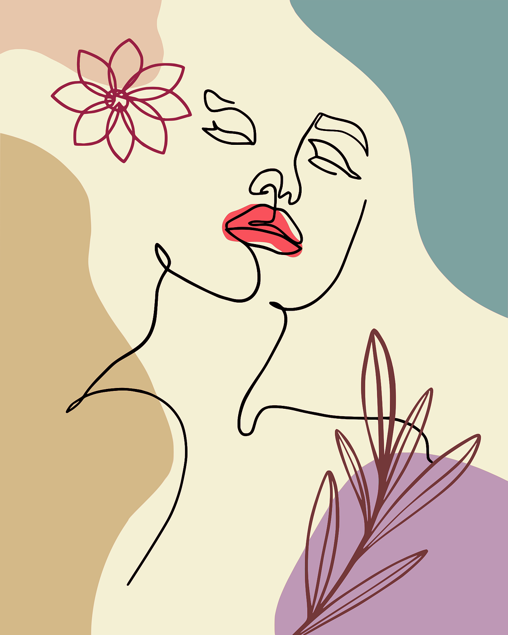

This line drawing is a great example of unity at work. The simplicity of the shapes blends perfectly together and forms a completion of objects that aren’t there but are perceived by the eye.
Elements and Principles of Design in Conclusion
Learning the elements and principles of design is essential to becoming an exceptional artist or designer.
To summarize, every piece of work uses point, line, shape, form, and color elements. These are the building blocks that form the visuals and structure.
The principles include contrast, balance, pattern, variety, and unity. These guidelines use elements to tell a story or atmosphere and help blend the elements effectively.
Knowing these elements and principles will help you see beyond what’s tangible and produce more professional designs.
