A strong online presence is key for construction companies aiming to shine in the competitive market. A solid website draws in potential clients and serves as an ideal platform to display projects, share construction tips, and highlight expertise. That’s why I’ve compiled a list of some of the best construction company website examples. These sites stand out for their design, functionality, and user experience.
So, if you’re looking for inspiration to improve your construction website and make it more user-friendly and appealing, this list of top construction websites is a great place to start.
Top Construction Company Website Examples
Here, I’m showcasing excellent construction website examples that have nailed their online presence through their superior website, design elements, and branding.
Each of the best construction websites provides valuable lessons on using visuals, cohesive branding, and a user-focused approach to connect with their audience. This shows that even the most straightforward industry sites can have a touch of personality.
1. Snyder Construction Group
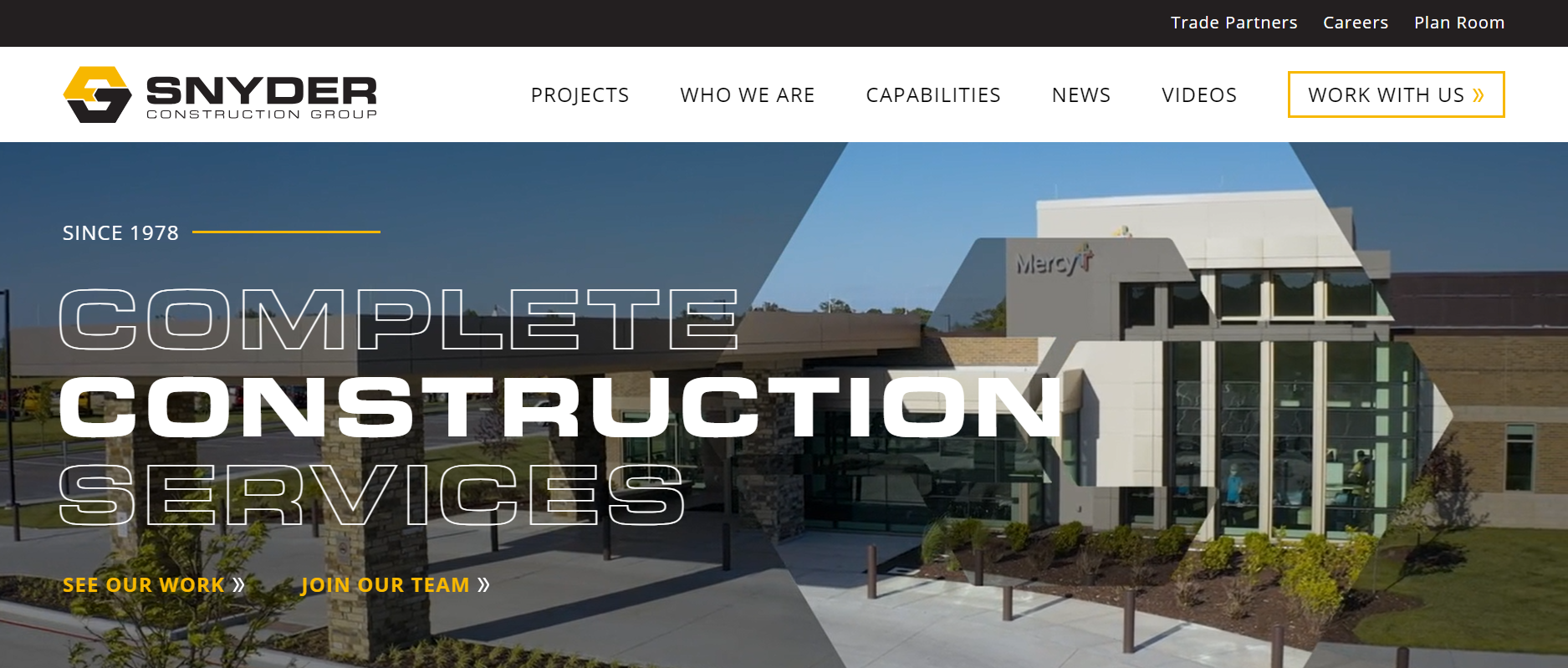
The Snyder Construction Group website has a clean, modern design that reflects the company’s focus on sustainable construction practices. Its use of high-quality photography and great background video montage showcases the company’s expertise.
The branding is on point, with a consistent color scheme and logo placement throughout the site. The transitions are smooth and non-intrusive.
I particularly love this “Day in the Life of a Superintendent” video, which gives potential customers a glimpse into commercial construction management and reflects their company values and culture.
2. Blach Construction
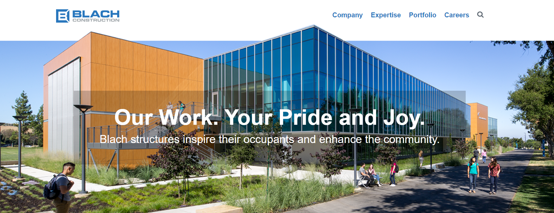

The Blach Construction website immediately grabs your attention with its bold, striking visuals. This website feels modern and up to date, using visually appealing, high-quality images and san-serif font. The color scheme of this strategic web design is consistent and ties in with the company’s branding.
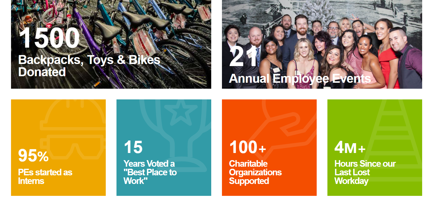
I love the Blach-at-a-Glance section of the About Us page, which has many figures about the company that reflect its success, experience, and ethos. It’s a great way to showcase the company’s services without overwhelming interested visitors with too much text.

3. Castle Homes Website
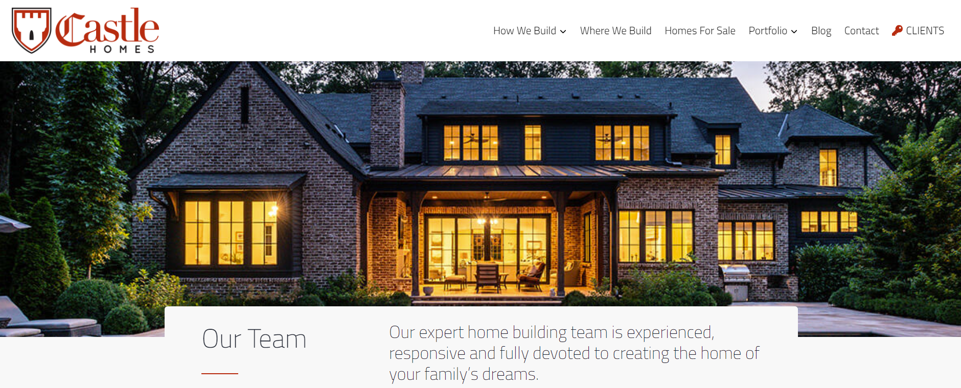

Castle Homes is all about luxury custom home building, and this great website does an excellent job of showcasing that. The high-quality images and videos throughout the site give website visitors a peek into their completed projects, while the clean navigation makes it easy to explore different projects.
The gorgeous photography showcases the attention to detail and craftsmanship that goes into their homes. The blog features articles about standards of excellence in modern construction, demonstrating the company’s expertise in their field.
4. Luxury Simplified
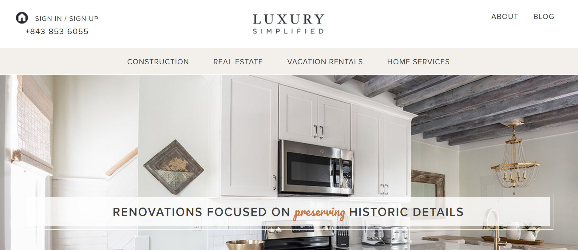

Luxury Simplified is a real estate and construction company specializing in custom homes and property management. I found this construction website an absolute joy to navigate.
The simplicity of the white background has a calming feel, allowing the properties to take center stage. True to its name, this website design proves that complexity isn’t necessary for impact.
5. Maman Corp
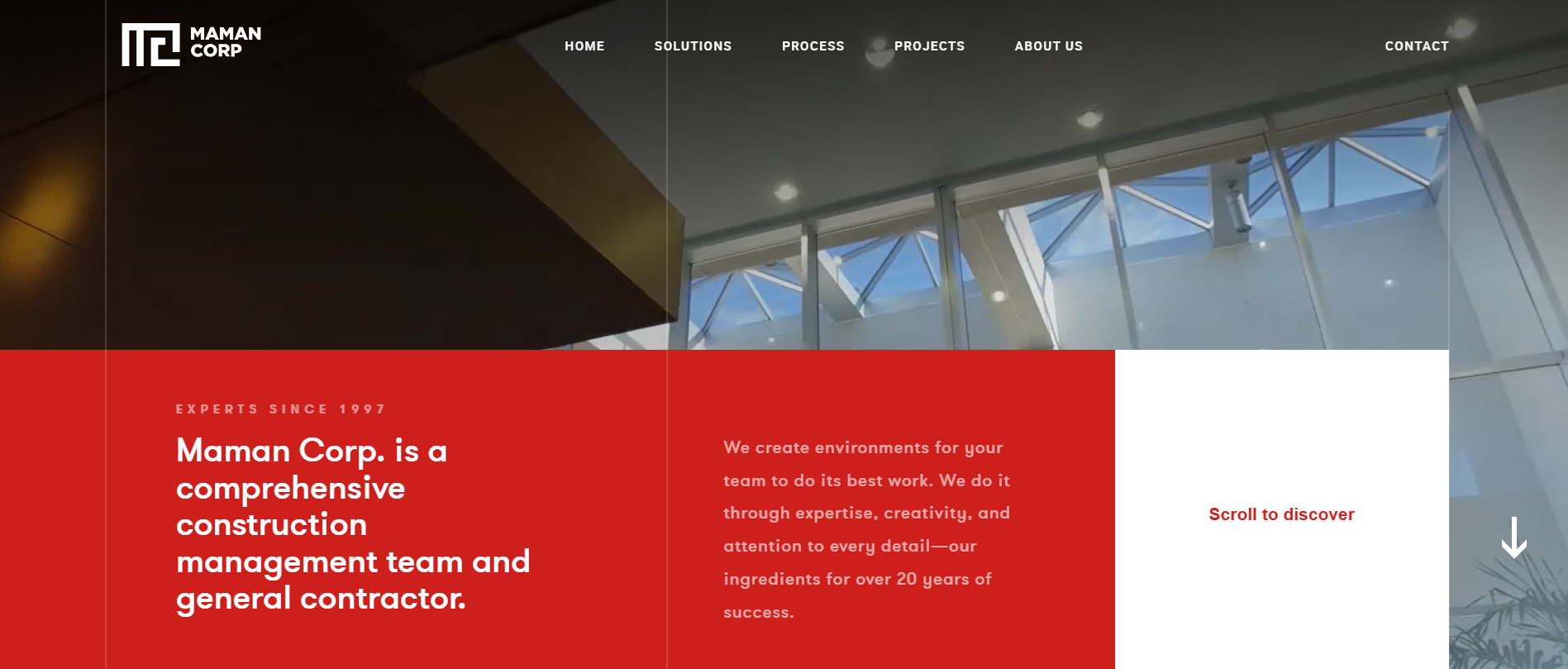

Interactive features are the name of the game on the Maman Corp website. The Scroll to Discover feature on the homepage and projects page is impressive and encourages visitors to explore further. Website visitors can download brochures from the Solutions page.
These features give visitors an immersive experience while learning more about the company.
6. McCownGordon Construction
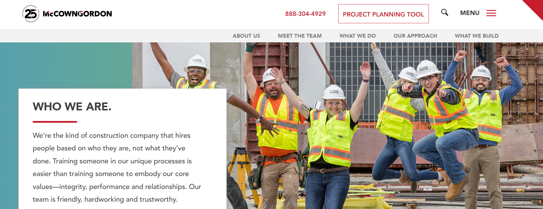

The MccownGordon website clearly subscribes to the idea that while a picture can paint a thousand words, a video is worth even more. Nearly every page uses video to showcase what they do and how they do it.
The website shows that the company is dedicated to diversity and inclusion, as demonstrated through its Mentor/Protégé Program, proving they truly embody their values to understand, include, and inspire.
7. Brymor Group
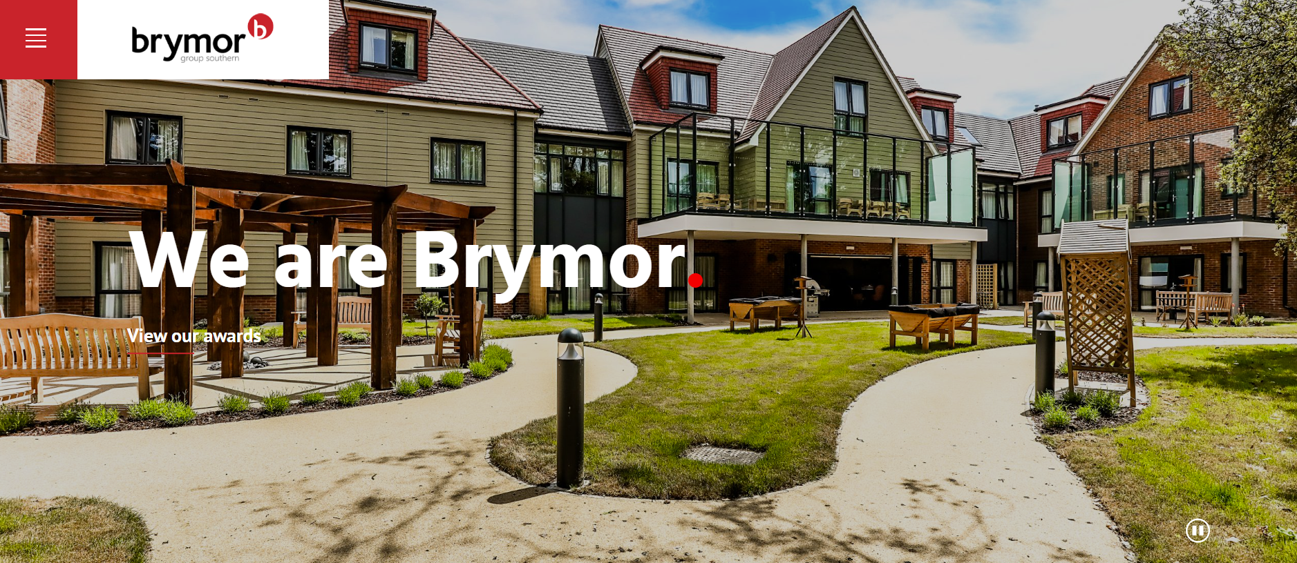

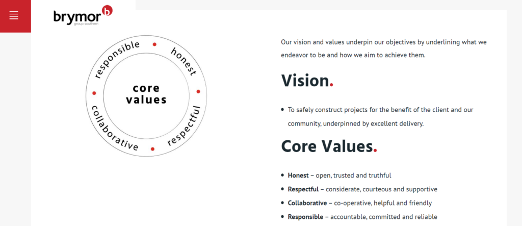
It is clear from the Brymor Group website that they value innovative solutions. You won’t lose your cursor on this site, as it turns into an arrow inside a circle when hovering over the high-quality photos.
Their case studies are all available in PDF format. The company’s color scheme ensures the website looks consistent. This site demonstrates that a simple, well-thought-out design can really stand out.

Why Your Construction Company Needs A Website
In this digital era, it’s pretty much a no-brainer that your construction company needs its own slice of the internet. Here’s why:
- Builds Credibility: A slick website gives your construction business serious clout. It shows potential clients you’re not just some fly-by-night operation but a pro team ready to tackle their projects.
- Boosts Visibility: A website makes your construction business pop up on search engines, making it easier for new clients to stumble upon you while searching for top-notch construction services.
- Nonstop Access: A website means your company is on the job 24/7 in a digital sense. Clients can explore what you offer, view your past projects, and contact you on their own schedule.
- Showcases Your Work: Use your website as a portfolio to flash your construction projects and expertise. It’s a prime spot to highlight what makes your company the go-to for construction needs, drawing in clients looking for exactly what you’ve got.
- Streamlined Communication: Make it easy for your potential clients to reach out by incorporating straightforward contact options on your website, like a form, direct email, or a clickable phone number.
- Cost-Efficient Promotion: Use your website as an affordable promotional tool, which not only slashes the costs associated with traditional advertising methods but also significantly broadens your audience reach.
- Stand Out from the Crowd: Having an up-to-date website signals to your competitors and clients that you’re riding the wave of technology, giving you an edge in the construction market.
- All-in-One Information Center: Consolidate all essential business intel—from your contact information to the latest projects and special offers—on your site, making it super easy for visitors to discover exactly what they need.
For those hammering their way into the construction scene, get some inspiration for your own site branding with our collection of construction company name ideas and catchy construction slogans.
What Makes a Construction Company Website Stand Out?
A close look at top-performing construction business website examples reveals the critical aspects of a remarkable website. These aspects include:
- Sleek design: Ensure your construction website reflects your company’s ethos and identity, using high-resolution images and a color palette aligned with your brand. The website should have straightforward navigation to enhance user experience.
- Responsive design for various devices: With the widespread use of mobile devices for internet access, your web design must perform seamlessly across all platforms and on a desktop computer.
- SEO optimization for better visibility: Improve your online presence with a website optimized for search engines, incorporating relevant construction-related keywords, optimizing images, and ensuring quick loading times.
- Easy-to-use contact options: Include a simple contact form on your site to make it effortless for prospective clients to get in touch, potentially boosting your lead generation.
- Clear and concise information: Your website should plainly present your services and how to contact you, avoiding jargon.
- Regular updates and maintenance: Keep your website appealing with current content and ensure all links work correctly. Regular upkeep is also vital for security purposes.
- Strong call-to-action prompts: Use clear buttons to encourage visitors to book a consultation or arrange a service.
Essential Pages for Construction Websites


Adding your signature touch to any construction project makes all the difference, and your website should reflect the craftsmanship, dedication, and expertise you bring to the table. Here’s a blueprint to map out your content for your construction website and truly nail it:
- Homepage: Your homepage is the front door to your online presence. It needs to grab attention, clearly outline your construction services, and make navigating your site smooth and intuitive.
- About Us: Use this space to tell the company’s history, from your mission and vision to the unique skills you bring to the building site.
- Our Work: This is your digital portfolio of most impressive projects. Have pages dedicated to the building services you offer, from home renovation projects to commercial builds, with each entry supported by photos or videos. This shows what you’re capable of and also helps potential clients envision their own projects coming to life.
- Happy Clients: There’s nothing like hearing it straight from those who’ve worked with you. Include a section for customer testimonials to add social proof. It’s a word-of-mouth endorsement, just online.
- Contact Page: Your contact details should be easy to find on your construction website. List your phone number, email, and office location prominently. Adding a contact form and a map of areas your construction firm serves streamlines the process for potential clients looking to start a project.
- FAQs: Do your clients have questions? Of course. Tackle them head-on in a dedicated FAQs section, clearing up common queries and any possible confusion about your high-quality services.
- From The Field: Keep your audience in the loop with a blog. Share insights on construction trends, tips for project planning, or stories from recent builds. It’s a great way to add value while boosting your site’s visibility on search engines.
- Before & After Gallery: Show off the transformations your work has made possible with a gallery of your previous projects. Before-and-after pictures highlight your team’s skills and inspire prospects about what’s achievable.
Consider this layout a foundation. Each section is an opportunity to explain why your construction company is the right choice for any project.
How to Set Up Your Construction Company Website
Leveraging WordPress coupled with Bigscoots Hosting lets you easily set up a standout construction website without breaking a sweat or the bank. WordPress is the go-to for effortlessly spinning up a good construction site that showcases your construction projects and services without requiring coding wizardry.
Thanks to its flexible themes and handy plugins, adding essential features like project galleries, client inquiry forms, and service descriptions to your site is a breeze. This makes your online presence as solid as your builds.
Bigscoots Hosting ensures your website’s foundation is rock-solid. They offer dependable, speedy, and secure hosting tailored for WordPress sites. They’ve covered you with blazing-fast load times and top-notch security against web threats.
With WordPress and Bigscoots Hosting, creating a polished and professional construction website is straightforward. This ensures that your website is built to stand out in the digital landscape.
Recommended Website Builders for Construction Companies
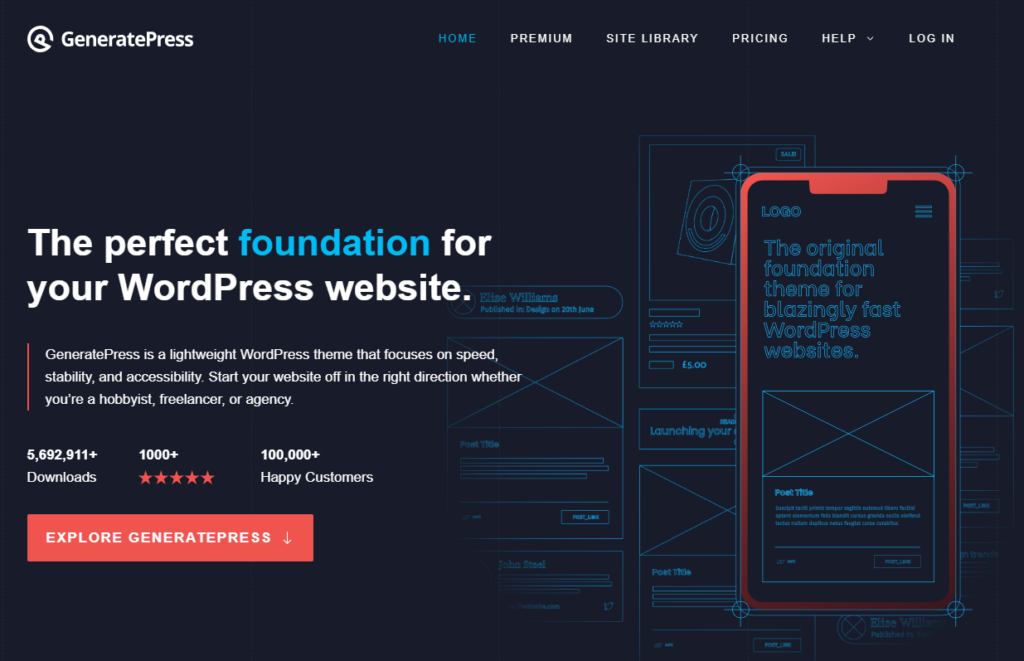

Selecting the perfect template is a game-changer when constructing a top-notch construction website. An exceptional website design leaves a lasting impression and ensures your site is a breeze to navigate.
I’d suggest giving GeneratePress or Astra a whirl. They’re speedy, easy to customize, and gel beautifully with well-known web editors.
- GeneratePress focuses on neatness and velocity, elevating your site’s professional vibe while pushing you up the search engine rankings.
- Astra boasts a vast collection of pre-built websites right out of the box, so choosing one that fits with your company’s vibe and getting your site up and running is painless. It’s straightforward to use and shines performance-wise, ensuring your construction services are showcased in the best possible light.
Opting for GeneratePress or Astra is a solid move to enhance the aesthetic and efficiency of your construction company’s website, helping you make a good first impression on potential clients.


Final Thoughts on These Construction Company Website Examples
Kicking off a standout construction industry website is crucial for drawing in fresh clientele and also for nailing that first impression as a top-notch construction authority. By drawing inspiration from the cream of the crop in construction website design, you’re paving the way for a stronger web presence.
Why not break ground on your construction company’s own website today and start seeing the solid foundation it lays for your business growth?
