The 255 million customers who visit Walmart each week are about to see something new—and even more blue—because Walmart is introducing its first brand update in nearly two decades.
A lot has happened since Walmart introduced its last rebrand in 2008, with its lower-case-loving, flat-graphicked response to Y2K’s digital maximalism. Smartphones were just taking off, and the brick and mortar retailer would be entering a decade of new competition from its growing rival, Amazon. But Walmart evolved just enough to stay dominant. It invested in its own excellent app and Walmart+ subscription delivery, expanded into services like advertising and healthcare, and increased its network of fulfillment centers to rival Amazon’s shipping speed. The company made $158 billion in 2024, with revenues up by 7% and ecommerce revenue now topping $100 billion (growing a wild 27% in Q3 of 2024 alone). The Walmart of today—still the world’s largest retailer—looks surprisingly resilient in a time of global uncertainty.
“We’re more modern, more digital—we say that ‘we’re people led and tech powered,’” says William White, CMO at Walmart. “And the changes we’re making here are in service of how we’ve evolved our business and offerings to our customers.”
To articulate this as a new brand, Walmart teamed up with Jones Knowles Ritchie (JKR), known for its makeovers to Burger King, Chobani, and Impossible, to name a few, along with Landor for some in-store work.
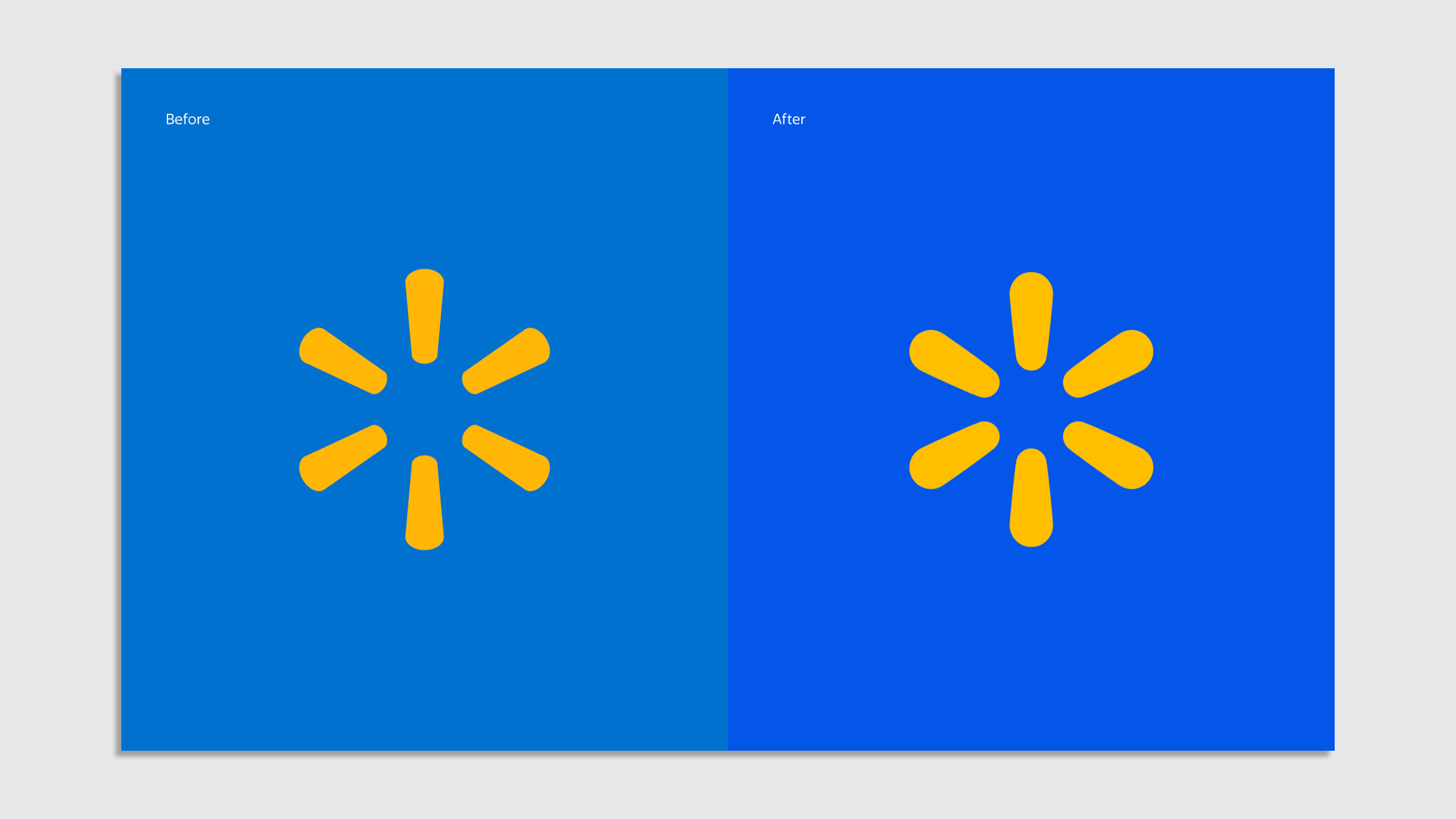
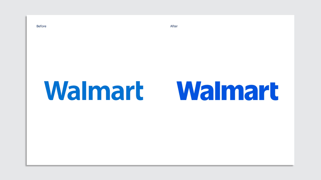
Frankly, the biggest changes across the logo and brand may be hard for the unobservant eye to spot. The word Walmart has been redrawn and separated from the yellow “spark.” Meanwhile, the entire brand is backed by a new, brighter blue.
“You may say it’s subtle, but there are meaningful differences,” notes Williams, who says the team was inspired by tracing back into Walmart’s archives from the 1960s and ’70s. One icon in particular caught the eyes of creatives, a trucker cap donned by founder Sam Walton himself, with “Walmart” written in the typeface Antique Olive.
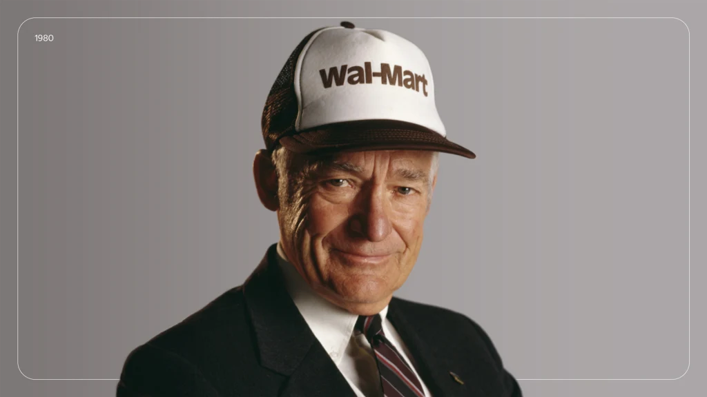
It was a serviceable, straightforward sans serif—a vibe certainly akin to Walmart itself. The team built its own typeface from this inspiration, which is ever so bolder and more sumptuous (no Ozempic in these letterforms!) than the skinnier riff on Myriad Pro that Walmart’s been using since 2008.
At the same time, Walmart redrew the spark, which appears all around better proportioned and more organic, thanks to a thicker footprint and less machined-looking curves.
“We wanted to put more depth and impact to it, so it exudes a bit more Walmart energy and serves as a beacon for the brand,” says Williams. “It can be a standalone brand icon for us.”
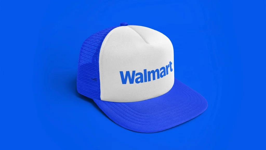
Color updates
The spark icon and Walmart wordmark each sit atop a new palette of blues. The hero of the collection, which you’ll see everywhere from the word Walmart, to user interfaces, to Walmart’s own storefronts, is what the company dubs True Blue.
True Blue is more vibrant than Walmart’s previous approach to blue. “It’s richer and warmer,” promises Williams, when compared to a similar but duller blue Walmart had used in the past. But side-by-siding these blues can be tricky. As I researched Walmart’s own use of blue across apps, ads, and stores, I found it was rendered in all sorts of different hues.
“One thing you might be noting is that we, perhaps, have been a little inconsistent in deploying all of our brand assets,” says Williams. “In the process of creating a new design system, we are trying to put much more thought and care into how they get deployed and used.”

True Blue—chosen largely for how effortlessly it appears alongside Fashion and Home categories—is paired with friends Benttonville Blue (which delves into a deep navy) and accents Sky Blue and Everyday Blue. The mix of blues is meant to cut through too much monotony and add depth, even as Walmart owns the color.
But I will admit, as I see this brand system play out across Walmart’s own branded merchandise and storefronts, it has the bright but paired-back vibe of IKEA. It seems to say, “Yes I’m here because I’m on a budget, but I do have taste.” I’m particularly impressed by the minimalism of Walmart’s advertisements that are part of this system. They have a clean and minimal presentation that’s intentionally reminiscent of an ecommerce site—like you can tap or click a bus stop ad to buy something with your eyes.
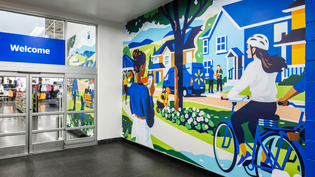
I wish I could say the same for Walmart’s approach to illustration, its flat cartoon scenes that will greet customers in store. Instead of minimal, they simply look cheap, like the sort of generic clipart your local park district might stick into a brochure.
You could say this is actually the perfect approach for your friendly neighborhood mega retailer. Williams himself argues that the illustration builds upon Walmart’s brand equity and meets the customer where they are. “We didn’t want to take a step, or too many tapes from our customer, that we became unrecognizable in any way,” he says.
Those are all fair points, but I also can’t help but wonder if Walmart is underestimating the taste or creativity of its own audience, that the imagery is uninspired and drab and misses the opportunity to instill a shopping trip with a bit more of something than a slice of visual Wonder Bread (a criticism offered by this Walmart+ customer who has saved $5,479.03 over the life of his subscription.)
Walmart’s new brand will roll out across digital properties through January, and across stores in the coming years.
